# rc-tabs

---

React Tabs

[![NPM version][npm-image]][npm-url]
[![build status][travis-image]][travis-url]
[![Test coverage][coveralls-image]][coveralls-url]
[![gemnasium deps][gemnasium-image]][gemnasium-url]
[![npm download][download-image]][download-url]

[npm-image]: http://img.shields.io/npm/v/rc-tabs.svg?style=flat-square
[npm-url]: http://npmjs.org/package/rc-tabs
[travis-image]: https://img.shields.io/travis/react-component/tabs.svg?style=flat-square
[travis-url]: https://travis-ci.org/react-component/tabs
[coveralls-image]: https://img.shields.io/coveralls/react-component/tabs.svg?style=flat-square
[coveralls-url]: https://coveralls.io/r/react-component/tabs?branch=master
[gemnasium-image]: http://img.shields.io/gemnasium/react-component/tabs.svg?style=flat-square
[gemnasium-url]: https://gemnasium.com/react-component/tabs
[node-url]: http://nodejs.org/download/
[download-image]: https://img.shields.io/npm/dm/rc-tabs.svg?style=flat-square
[download-url]: https://npmjs.org/package/rc-tabs

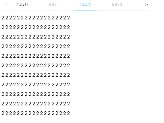
## Screenshot

<img src='https://zos.alipayobjects.com/rmsportal/JwLASrsOYJuFRIt.png' width='408'>

## Example

http://localhost:8000/examples

online example: http://react-component.github.io/tabs/

## install

[![rc-tabs](https://nodei.co/npm/rc-tabs.png)](https://npmjs.org/package/rc-tabs)

## Feature

### Keyboard

- left and up: switch to previous tab
- right and down: switch to next tab

## Usage

```js
import Tabs, { TabPane } from "rc-tabs";
import TabContent from "rc-tabs/lib/TabContent";
import ScrollableInkTabBar from "rc-tabs/lib/ScrollableInkTabBar";

var callback = function(key) {};

React.render(
  <Tabs defaultActiveKey="2" onChange={callback} renderTabBar={() => <ScrollableInkTabBar />} renderTabContent={() => <TabContent />}>
    <TabPane tab="tab 1" key="1">
      first
    </TabPane>
    <TabPane tab="tab 2" key="2">
      second
    </TabPane>
    <TabPane tab="tab 3" key="3">
      third
    </TabPane>
  </Tabs>,
  document.getElementById("t2")
);
```

### Usage of navWrapper() function

navWrapper() prop allows to wrap tabs bar in a component to provide additional features.  
Eg with react-sortablejs to make tabs sortable by DnD :

```js
import Sortable from 'react-sortablejs';

navWrapper={(content) => <Sortable>{content}</Sortable>}
```

## API

### Tabs

#### props:

<table class="table table-bordered table-striped">
    <thead>
    <tr>
        <th style="width: 100px;">name</th>
        <th style="width: 50px;">type</th>
        <th>default</th>
        <th>description</th>
    </tr>
    </thead>
    <tbody>
      <tr>
          <td>activeKey</td>
          <td>String</td>
          <th></th>
          <td>current active tabPanel's key</td>
      </tr>
      <tr>
          <td>tabBarPosition</td>
          <td>String</td>
          <th></th>
          <td>tab nav 's position. one of ['left','right','top','bottom']</td>
      </tr>
      <tr>
          <td>defaultActiveKey</td>
          <td>String</td>
          <th>first active tabPanel's key</th>
          <td>initial active tabPanel's key if activeKey is absent</td>
      </tr>
      <tr>
         <td>renderTabBar</td>
         <td>():React.Node</td>
         <th></th>
         <td>How to render tab bar</td>
      </tr>
      <tr>
        <td>renderTabContent</td>
        <td>():React.Node</td>
        <th></th>
        <td>How to render tab content</td>
      </tr>
      <tr>
         <td>navWrapper</td>
         <td>(tabContent: React.Node):React.Node</td>
         <th></th>
         <td>Wrapper function that will wrap around tab panes, whould be useful for features such as drag and drop</td>
      </tr>
      <tr>
          <td>onChange</td>
          <td>(key: string): void</td>
          <th></th>
          <td>called when tabPanel is changed</td>
      </tr>
      <tr>
          <td>destroyInactiveTabPane</td>
          <td>Boolean</td>
          <th>false</th>
          <td>whether destroy inactive tabpane when change tab</td>
      </tr>
      <tr>
          <td>prefixCls</td>
          <td>String</td>
          <th>rc-tabs</th>
          <td>prefix class name, use to custom style</td>
      </tr>
      <tr>
          <td>direction</td>
          <td>String</td>
          <th>ltr</th>
          <td>Layout direction of tabs component, it supports RTL direction too.</td>
      </tr>
    </tbody>
</table>

### TabPane

#### props:

<table class="table table-bordered table-striped">
    <thead>
      <tr>
          <th style="width: 100px;">name</th>
          <th style="width: 50px;">type</th>
          <th>default</th>
          <th>description</th>
      </tr>
    </thead>
    <tbody>
      <tr>
          <td>key</td>
          <td>Object</td>
          <th></th>
          <td>corresponding to activeKey, should be unique</td>
      </tr>
      <tr>
          <td>style</td>
          <td>Object</td>
          <th></th>
          <td></td>
      </tr>
      <tr>
         <td>placeholder</td>
         <td>React.Node</td>
         <th></th>
         <td>lazyrender children</td>
      </tr>
      <tr>
          <td>tab</td>
          <td>React.Node</td>
          <th></th>
          <td>current tab's title corresponding to current tabPane</td>
      </tr>
      <tr>
          <td>forceRender</td>
          <td>Boolean</td>
          <td>false</td>
          <td>forced render of content in tabs,  not lazy render after clicking on tabs</td>
      </tr>
    </tbody>
</table>

### lib/TabBar

<table class="table table-bordered table-striped">
    <thead>
      <tr>
          <th style="width: 100px;">name</th>
          <th style="width: 50px;">type</th>
          <th>default</th>
          <th>description</th>
      </tr>
    </thead>
    <tbody>
      <tr>
          <td>onTabClick</td>
          <td>(key: string, event: MouseEvent): void</td>
          <th></th>
          <td>callback when tab clicked</td>
      </tr>
      <tr>
          <td>style</td>
          <td></td>
          <th></th>
          <td>bar style</td>
      </tr>
      <tr>
        <td>extraContent</td>
        <td>React Node</td>
        <th></th>
        <td>extra content placed one the right of tab bar</td>
      </tr>
      <tr>
        <td>tabBarGutter</td>
        <td>number</td>
        <th></th>
        <td>the gap between tabs</td>
      </tr>
    </tbody>
</table>

### lib/InkTabBar

tab bar with ink indicator, in addition to tab bar props, extra props:

<table class="table table-bordered table-striped">
    <thead>
      <tr>
          <th style="width: 100px;">name</th>
          <th style="width: 50px;">type</th>
          <th>default</th>
          <th>description</th>
      </tr>
    </thead>
    <tbody>
      <tr>
          <td>styles</td>
          <td>{ inkBar }</td>
          <th></th>
          <td>can set inkBar style</td>
      </tr>
    </tbody>
</table>

### lib/ScrollableTabBar

scrollable tab bar, in addition to tab bar props, extra props:

<table class="table table-bordered table-striped">
    <thead>
      <tr>
          <th style="width: 100px;">name</th>
          <th style="width: 50px;">type</th>
          <th>default</th>
          <th>description</th>
      </tr>
    </thead>
    <tbody>
      <tr>
          <td>onPrevClick</td>
          <td>(e: Event): void</td>
          <th></th>
          <td>callback when prev button is clicked</td>
      </tr>
      <tr>
          <td>onNextClick</td>
          <td>(e: Event): void</td>
          <th></th>
          <td>callback when next button is clicked</td>
      </tr>
      <tr>
          <td>prevIcon</td>
          <td>ReactNode</td>
          <th></th>
          <td>specific the prev icon</td>
      </tr>
      <tr>
          <td>nextIcon</td>
          <td>ReactNode</td>
          <th></th>
          <td>specific the next icon</td>
      </tr>
    </tbody>
</table>

### lib/ScrollableInkTabBar

scrollable tab bar with ink indicator, same with tab bar and ink bar and scrollable bar props.

| name     | type           | default | description            |
| -------- | -------------- | ------- | ---------------------- |
| children | (node) => node | -       | Customize tab bar node |

### lib/SwipeableInkTabBar (Use for Mobile)

swipeable tab bar with ink indicator, same with tab bar/ink bar props, and below is the additional props.

<table class="table table-bordered table-striped">
    <thead>
      <tr>
          <th style="width: 100px;">name</th>
          <th style="width: 50px;">type</th>
          <th>default</th>
          <th>description</th>
      </tr>
    </thead>
    <tbody>
      <tr>
          <td>pageSize</td>
          <td>number</td>
          <th>5</th>
          <td>show how many tabs at one page</td>
      </tr>
      <tr>
          <td>speed</td>
          <td>number</td>
          <th>5</th>
          <td>swipe speed, 1 to 10, more bigger more faster</td>
      </tr>
      <tr>
          <td>hammerOptions</td>
          <td>Object</td>
          <td></td>
          <td>options for react-hammerjs</td>
      </tr>
    </tbody>
</table>

### lib/TabContent

<table class="table table-bordered table-striped">
    <thead>
      <tr>
          <th style="width: 100px;">name</th>
          <th style="width: 50px;">type</th>
          <th>default</th>
          <th>description</th>
      </tr>
    </thead>
    <tbody>
      <tr>
          <td>style</td>
          <td>Object</td>
          <td></td>
          <td>tab content style</td>
      </tr>
      <tr>
          <td>animated</td>
          <td>Boolean</td>
          <td>true</td>
          <td>whether tabpane change with animation</td>
      </tr>
      <tr>
          <td>animatedWithMargin</td>
          <td>Boolean</td>
          <td>false</td>
          <td>whether animate tabpane with css margin</td>
      </tr>
    </tbody>
</table>

### lib/SwipeableTabContent

swipeable tab panes, in addition to lib/TabContent props, extra props:

<table class="table table-bordered table-striped">
    <thead>
      <tr>
          <th style="width: 100px;">name</th>
          <th style="width: 50px;">type</th>
          <th>default</th>
          <th>description</th>
      </tr>
    </thead>
    <tbody>
      <tr>
          <td>hammerOptions</td>
          <td>Object</td>
          <td></td>
          <td>options for react-hammerjs</td>
      </tr>
    </tbody>
</table>

## Note

If you want to support old browsers(which does not support flex/css-transition),
please load the following script inside head to add no-flexbox/no-csstransition css classes

```
https://as.alipayobjects.com/g/component/modernizr/2.8.3/modernizr.min.js
```

## Development

```
npm install
npm start
```

## Test Case

```
npm test
npm run chrome-test
```

## Coverage

```
npm run coverage
```

open coverage/ dir

## License

rc-tabs is released under the MIT license.
