| overlayClassName |
string |
|
additional className added to popup overlay |
| overlayStyle |
Object |
|
additional style of overlay node |
| prefixCls |
String |
rmc-tooltip |
prefix class name |
| transitionName |
String |
|
same as https://github.com/react-component/css-transition-group |
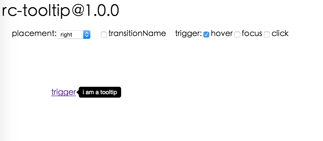
| onVisibleChange |
Function |
|
call when visible is changed |
| afterVisibleChange |
Function |
|
call after visible is changed |
| visible |
boolean |
|
whether tooltip is visible |
| defaultVisible |
boolean |
|
whether tooltip is visible initially |
| placement |
String |
|
one of ['left','right','top','bottom', 'topLeft', 'topRight', 'bottomLeft', 'bottomRight'] |
| align |
Object: alignConfig of [dom-align](https://github.com/yiminghe/dom-align) |
|
value will be merged into placement's config |
| onPopupAlign |
function(popupDomNode, align) |
|
callback when popup node is aligned |
| overlay |
React.Element | () => React.Element |
|
popup content |
| arrowContent |
React.Node |
null |
arrow content |
| getTooltipContainer |
function |
|
Function returning html node which will act as tooltip container. By default the tooltip attaches to the body. If you want to change the container, simply return a new element. |
| destroyTooltipOnHide |
boolean |
false |
whether destroy tooltip when tooltip is hidden |
 ## Install
[](https://npmjs.org/package/rmc-tooltip)
## Usage
```js
var Tooltip = require('rmc-tooltip');
var React = require('react');
var ReactDOM = require('react-dom');
// By default, the tooltip has no style.
// Consider importing the stylesheet it comes with:
// 'rmc-tooltip/assets/bootstrap_white.css'
ReactDOM.render(
## Install
[](https://npmjs.org/package/rmc-tooltip)
## Usage
```js
var Tooltip = require('rmc-tooltip');
var React = require('react');
var ReactDOM = require('react-dom');
// By default, the tooltip has no style.
// Consider importing the stylesheet it comes with:
// 'rmc-tooltip/assets/bootstrap_white.css'
ReactDOM.render(