| prefixCls |
String |
rc-dialog |
The dialog dom node's prefixCls |
| className |
String |
|
additional className for dialog |
| wrapClassName |
String |
|
additional className for dialog wrap |
| style |
Object |
{} |
Root style for dialog element.Such as width, height |
| zIndex |
Number |
|
|
| bodyStyle |
Object |
{} |
body style for dialog body element.Such as height |
| maskStyle |
Object |
{} |
style for mask element. |
| visible |
Boolean |
false |
current dialog's visible status |
| animation |
String |
|
part of dialog animation css class name |
| maskAnimation |
String |
|
part of dialog's mask animation css class name |
| transitionName |
String |
|
dialog animation css class name |
| maskTransitionName |
String |
|
mask animation css class name |
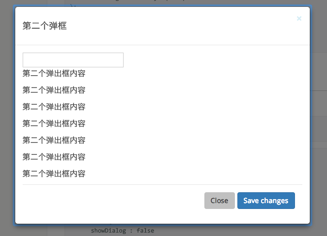
| title |
String|React.Element |
|
Title of the dialog |
| footer |
React.Element |
|
footer of the dialog |
| closable |
Boolean |
true |
whether show close button |
| mask |
Boolean |
true |
whether show mask |
| maskClosable |
Boolean |
true |
whether click mask to close |
| keyboard |
Boolean |
true |
whether support press esc to close |
| mousePosition |
{x:number,y:number} |
|
set pageX and pageY of current mouse(it will cause transform origin to be set). |
| onClose |
function() |
|
called when click close button or mask |
| afterClose |
function() |
|
called when close animation end |
| getContainer |
function(): HTMLElement |
|
to determine where Dialog will be mounted |
| destroyOnClose |
Boolean |
false |
to unmount child compenents on onClose |
| closeIcon |
ReactNode |
|
specific the close icon. |
| forceRender |
Boolean |
false |
Create dialog dom node before dialog first show |
| focusTriggerAfterClose |
Boolean |
true |
focus trigger element when dialog closed |
 ## Install
[](https://npmjs.org/package/rc-dialog)
## Usage
```js
var Dialog = require('rc-dialog');
ReactDOM.render(
), document.getElementById('t1'));
// use dialog
```
## API
### rc-dialog
## Install
[](https://npmjs.org/package/rc-dialog)
## Usage
```js
var Dialog = require('rc-dialog');
ReactDOM.render(
), document.getElementById('t1'));
// use dialog
```
## API
### rc-dialog