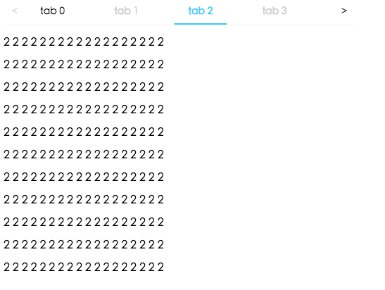
 ## Example
http://localhost:8000/examples
online example: http://react-component.github.io/tabs/
## install
[](https://npmjs.org/package/rc-tabs)
## Feature
### Keyboard
- left and up: switch to previous tab
- right and down: switch to next tab
## Usage
```js
import Tabs, { TabPane } from "rc-tabs";
import TabContent from "rc-tabs/lib/TabContent";
import ScrollableInkTabBar from "rc-tabs/lib/ScrollableInkTabBar";
var callback = function(key) {};
React.render(
## Example
http://localhost:8000/examples
online example: http://react-component.github.io/tabs/
## install
[](https://npmjs.org/package/rc-tabs)
## Feature
### Keyboard
- left and up: switch to previous tab
- right and down: switch to next tab
## Usage
```js
import Tabs, { TabPane } from "rc-tabs";
import TabContent from "rc-tabs/lib/TabContent";
import ScrollableInkTabBar from "rc-tabs/lib/ScrollableInkTabBar";
var callback = function(key) {};
React.render(
| name | type | default | description |
|---|---|---|---|
| activeKey | String | current active tabPanel's key | |
| tabBarPosition | String | tab nav 's position. one of ['left','right','top','bottom'] | |
| defaultActiveKey | String | first active tabPanel's key | initial active tabPanel's key if activeKey is absent |
| renderTabBar | ():React.Node | How to render tab bar | |
| renderTabContent | ():React.Node | How to render tab content | |
| navWrapper | (tabContent: React.Node):React.Node | Wrapper function that will wrap around tab panes, whould be useful for features such as drag and drop | |
| onChange | (key: string): void | called when tabPanel is changed | |
| destroyInactiveTabPane | Boolean | false | whether destroy inactive tabpane when change tab |
| prefixCls | String | rc-tabs | prefix class name, use to custom style |
| direction | String | ltr | Layout direction of tabs component, it supports RTL direction too. |
| name | type | default | description |
|---|---|---|---|
| key | Object | corresponding to activeKey, should be unique | |
| style | Object | ||
| placeholder | React.Node | lazyrender children | |
| tab | React.Node | current tab's title corresponding to current tabPane | |
| forceRender | Boolean | false | forced render of content in tabs, not lazy render after clicking on tabs |
| name | type | default | description |
|---|---|---|---|
| onTabClick | (key: string, event: MouseEvent): void | callback when tab clicked | |
| style | bar style | ||
| extraContent | React Node | extra content placed one the right of tab bar | |
| tabBarGutter | number | the gap between tabs |
| name | type | default | description |
|---|---|---|---|
| styles | { inkBar } | can set inkBar style |
| name | type | default | description |
|---|---|---|---|
| onPrevClick | (e: Event): void | callback when prev button is clicked | |
| onNextClick | (e: Event): void | callback when next button is clicked | |
| prevIcon | ReactNode | specific the prev icon | |
| nextIcon | ReactNode | specific the next icon |
| name | type | default | description |
|---|---|---|---|
| pageSize | number | 5 | show how many tabs at one page |
| speed | number | 5 | swipe speed, 1 to 10, more bigger more faster |
| hammerOptions | Object | options for react-hammerjs |
| name | type | default | description |
|---|---|---|---|
| style | Object | tab content style | |
| animated | Boolean | true | whether tabpane change with animation |
| animatedWithMargin | Boolean | false | whether animate tabpane with css margin |
| name | type | default | description |
|---|---|---|---|
| hammerOptions | Object | options for react-hammerjs |