| options |
Object |
|
The data options of cascade |
| value |
Array |
|
selected value |
| defaultValue |
Array |
|
initial selected value |
| onChange |
Function(value, selectedOptions) |
|
callback when finishing cascader select |
| changeOnSelect |
Boolean |
false |
change value on each selection |
| loadData |
Function(selectedOptions) |
|
callback when click any option, use for loading more options |
| expandTrigger |
String |
'click' |
expand current item when click or hover |
| popupVisible |
Boolean |
|
visibility of popup overlay |
| onPopupVisibleChange |
Function(visible) |
|
callback when popup overlay's visibility changed |
| transitionName |
String |
|
transition className like "slide-up" |
| prefixCls |
String |
rc-cascader |
prefix className of popup overlay |
| popupClassName |
String |
|
additional className of popup overlay |
| popupPlacement |
String |
bottomLeft |
use preset popup align config from builtinPlacements:bottomRight topRight bottomLeft topLeft |
| getPopupContainer |
function(trigger:Node):Node |
() => document.body |
container which popup select menu rendered into |
| dropdownMenuColumnStyle |
Object |
|
style object for each cascader pop menu |
| fieldNames |
Object |
{ label: 'label', value: 'value', children: 'children' } |
custom field name for label and value and children |
| expandIcon |
ReactNode |
> |
specific the default expand icon |
| loadingIcon |
ReactNode |
> |
specific the default loading icon |
 ## Example
http://react-component.github.io/cascader/
## Install
[](https://npmjs.org/package/rc-cascader)
```bash
$ npm install rc-cascader --save
```
## Usage
```js
import React from 'react';
import Cascader from 'rc-cascader';
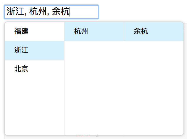
const options = [{
'label': '福建',
'value': 'fj',
'children': [{
'label': '福州',
'value': 'fuzhou',
'children': [{
'label': '马尾',
'value': 'mawei',
}],
}, {
'label': '泉州',
'value': 'quanzhou',
}],
}, {
'label': '浙江',
'value': 'zj',
'children': [{
'label': '杭州',
'value': 'hangzhou',
'children': [{
'label': '余杭',
'value': 'yuhang',
}],
}],
}, {
'label': '北京',
'value': 'bj',
'children': [{
'label': '朝阳区',
'value': 'chaoyang',
}, {
'label': '海淀区',
'value': 'haidian',
}],
}];
React.render(
## Example
http://react-component.github.io/cascader/
## Install
[](https://npmjs.org/package/rc-cascader)
```bash
$ npm install rc-cascader --save
```
## Usage
```js
import React from 'react';
import Cascader from 'rc-cascader';
const options = [{
'label': '福建',
'value': 'fj',
'children': [{
'label': '福州',
'value': 'fuzhou',
'children': [{
'label': '马尾',
'value': 'mawei',
}],
}, {
'label': '泉州',
'value': 'quanzhou',
}],
}, {
'label': '浙江',
'value': 'zj',
'children': [{
'label': '杭州',
'value': 'hangzhou',
'children': [{
'label': '余杭',
'value': 'yuhang',
}],
}],
}, {
'label': '北京',
'value': 'bj',
'children': [{
'label': '朝阳区',
'value': 'chaoyang',
}, {
'label': '海淀区',
'value': 'haidian',
}],
}];
React.render(